How Zohran Mamdani’s bold campaign design redefined New York City politics
Published: 09 November 2025, 5:14:28
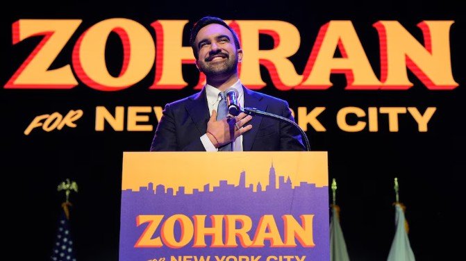
The vivid blue and orange campaign signs for Zohran Mamdani’s historic run for New York City mayor were impossible to miss this summer. Plastered on storefronts and telephone poles from Queens to the Bronx, the eye-catching posters stood apart from the traditional red, white, and blue political palette — and helped Mamdani make history as the city’s first Muslim and South Asian mayor.
While many assumed the color scheme and stylized lettering were inspired by vintage Bollywood art, designer Aneesh Bhoopathy, who created the visuals, said the look was rooted in the city itself. The bold hues, he explained, drew from the bright primary colors of bodegas, yellow taxis, and food carts that define New York’s streetscape.
“The font and color palette were designed to feel like New York — energetic, working-class, and authentic,” said Bhoopathy, a Philadelphia-based designer who has worked with Mamdani and the Queens chapter of the Democratic Socialists of America.
The font, featuring a drop shadow and vintage comic-book flair, evoked the hand-painted signs still seen in some neighborhoods. “Succinctly, it’s New York,” Bhoopathy said.
A trendsetting shift
Mamdani’s distinctive aesthetic even influenced his chief rival, former New York Governor Andrew Cuomo. Cuomo began his campaign with a traditional red, white, and blue logo but later adopted a blue-and-orange design — a nod not only to Mamdani’s colors but also to the New York Knicks and Mets — when he reentered the race as an independent after losing the Democratic primary.
A design rooted in culture and class
Experts said Mamdani’s branding was more than stylistic; it reflected the city’s cultural and working-class identity.
“They evoke the fabric of New York City — the bodegas, taxi cabs, and halal carts that sustain the city and showcase its diversity,” said David Schwittek, a professor of digital media and graphic design at Lehman College.
Gavan Fitzsimons, a Duke University professor who studies branding and consumer behavior, said the retro look also created “positive associations to happier political times,” evoking nostalgia among Democratic voters.
The campaign’s visual identity drew comparisons to Rep. Alexandria Ocasio-Cortez’s groundbreaking 2018 campaign posters, which also used bright colors and upward-slanting typography to signal optimism and connect with working-class roots.
Making politics feel personal
Court Stroud, a marketing professor at New York University, said Mamdani’s visual strategy succeeded in transforming political messaging into something people wanted to be part of.
“The playfulness of his campaign design created a brand that supporters wanted to wear and share,” Stroud said. “Mamdani’s team showed how using visual design as a secret handshake can make politics feel real and community driven.”
The visual identity’s popularity rippled across the city, inspiring viral campaigns like the “Hot Girls for Zohran” merchandise seen on model Emily Ratajkowski and other young supporters.
A lasting design legacy?
While it’s too soon to know if Mamdani’s aesthetic will influence campaigns nationally, experts agree it marks a turning point in how political visuals can break convention.
“It’s still rare for candidates to move away from the tried-and-true red, white, and blue,” said Lisa Burns, a media studies professor at Quinnipiac University. “But Mamdani’s success shows there’s power in authenticity.”
Schwittek believes that’s the true lesson of Mamdani’s visual strategy. “In a sea of sanitized political messaging, Mamdani’s visuals stand out because they mean something,” he said.
Designer Bhoopathy agreed that the campaign’s energy came from the candidate himself. “None of the boldness and vibrancy work without a candidate as full of life as the city that raised him,” he said.